Probably the coolest part of developing the skills to design stationary and do calligraphy was getting to make everything for my own wedding this past September. As I anticipated, it was really hard to narrow the field of vision for how I was going to create all the components, the look I wanted everything to have (I was a kid in a candy shop but also wanted cohesiveness) and have everything still be reflective of Justin and I and our wedding. First up was designing the Save the Dates!
I knew I wanted to showcase Tiffany’s artwork and the venue in some way, and I knew that I wanted there to be a small through-line to connect our Save the Dates to our invitations down the line. (Which is tougher than I thought! As I wasn’t quite ready to think about our invitations that early in the process.) I knew I would want some illustration and whimsy even if I can also appreciate simplicity and classic styles. Or did I want to do something edgy and on trend? It was hard to decide! The best advice I could impart should you find yourself in a similar situation is to go with elements and colors that you really, really (both) like. No matter what. If you stick with what you love, stick with what makes you excited, it will still be something that you find yourself gravitating toward later on, when the time comes to design your invitations (and even your wedding elements for the day of!) It’s a step further for me, since I know how many different techniques I have to choose from as well! I knew I wanted to incorporate brush lettering somehow in the process, (writing everything in a paint brush, vs. pen) but I also love classic calligraphy and wanted to show both. This led to the decision to use brush lettering for the Save the Dates (which gave them a more casual feel and kept things a little more restrained so that I would have somewhere to go once we made it to invitation design.)
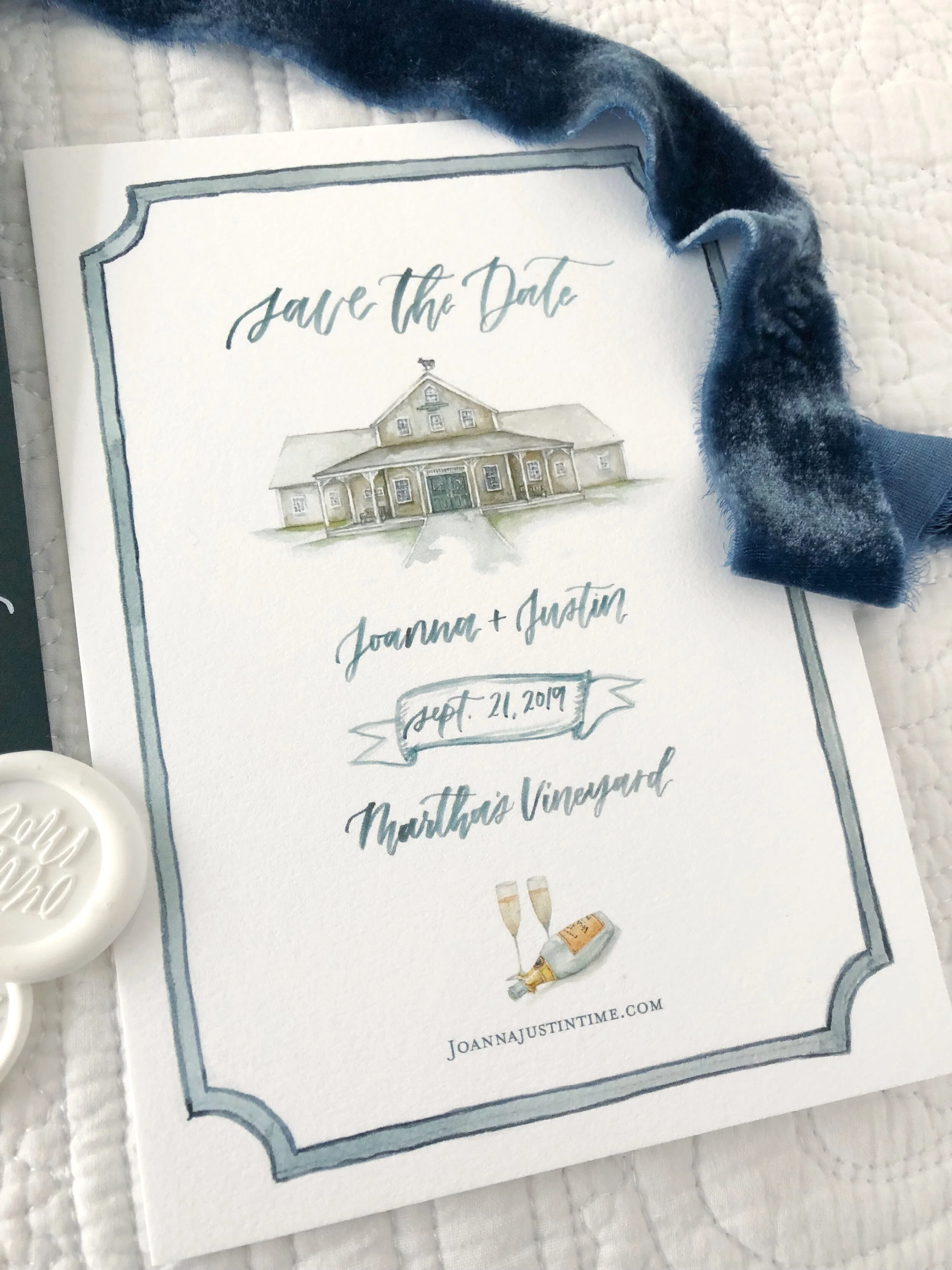
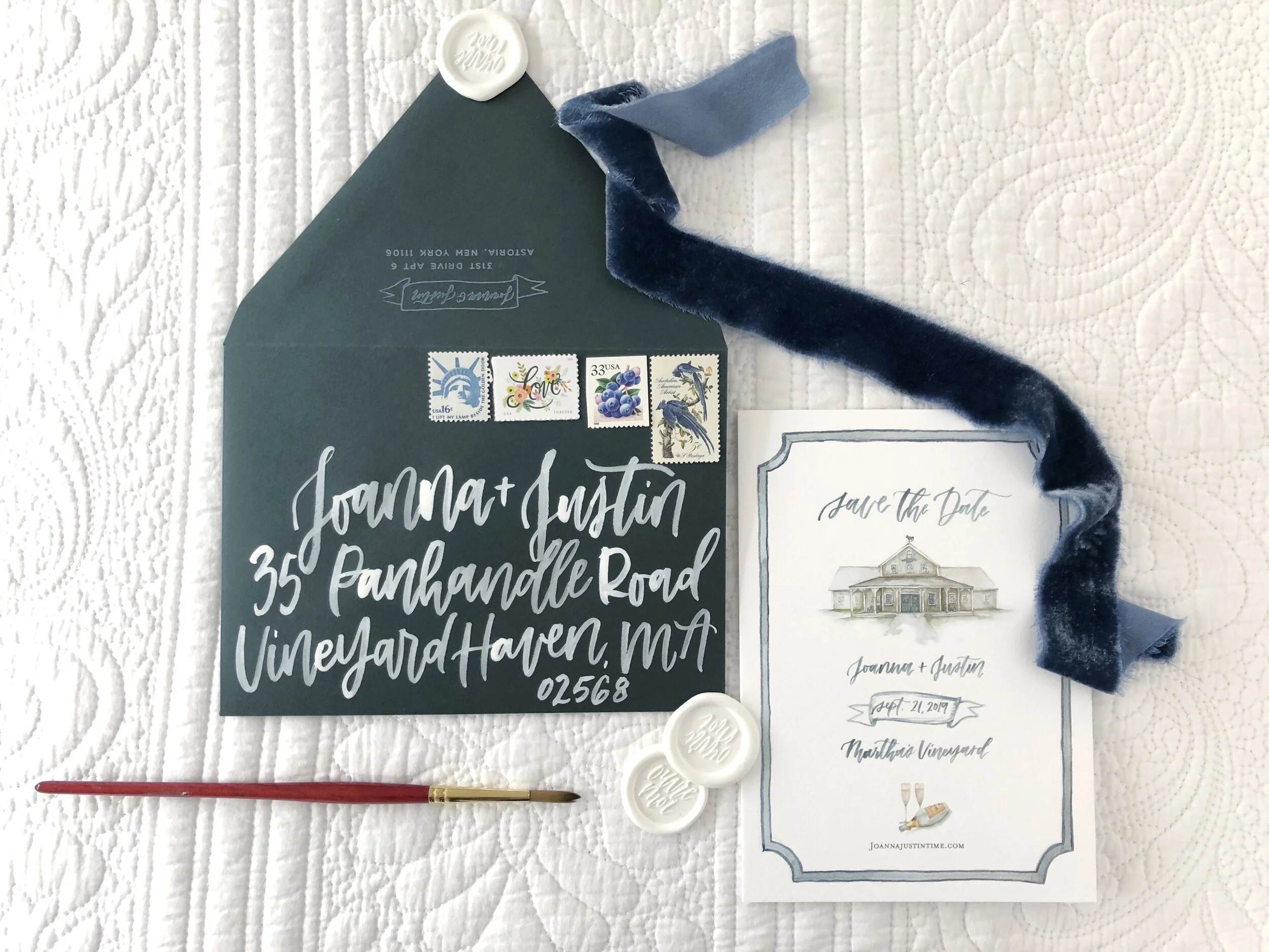
We featured the Martha’s Vineyard Agricultural Hall in West Tisbury (where our reception was) and some celebratory bubbles to get everyone in the mood. :) I stayed in keeping with shades of ocean blues and seaweed greens. I have always LOVED this color envelope, so I knew I’d want to use it if at all possible. I knew when it came time to bring in the shades of blues (my inspiration was a mussel shell!) down the line for my invitations and wedding colors, that there would be harmony.
I included a photo of Tiffany’s illustration of the Ag Hall which is what inspired the rest of the card!
For an added touch, I created a wax seal that says “Open Me” en français! Printed with my friends at Print Icon.


