Photos by myself and professional photos by Micaela Grace.
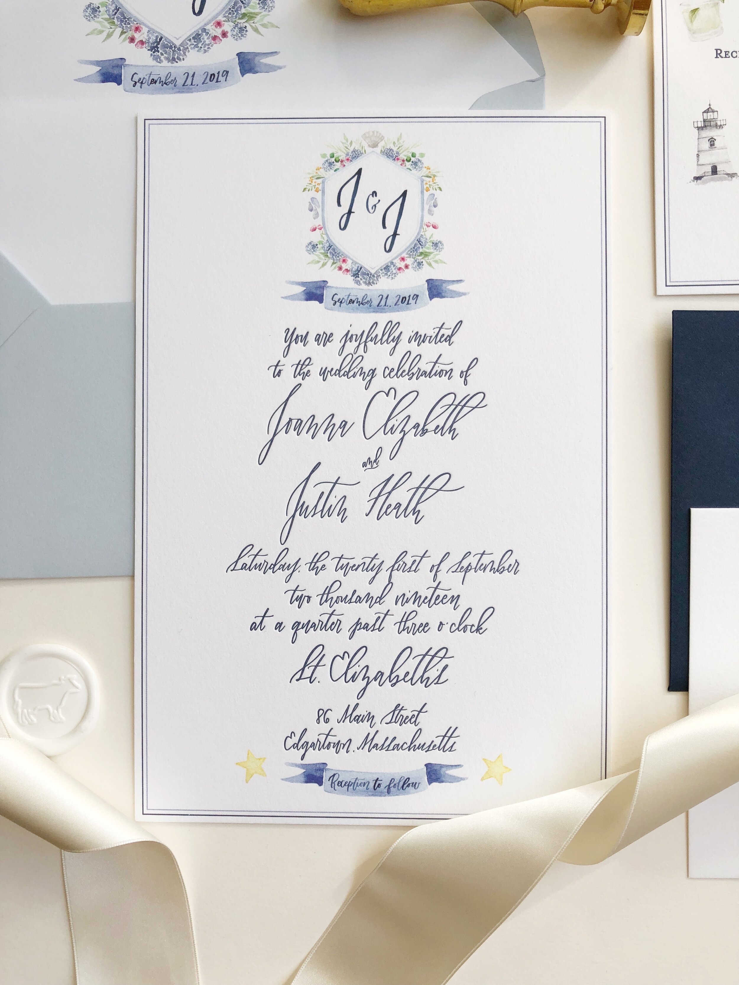
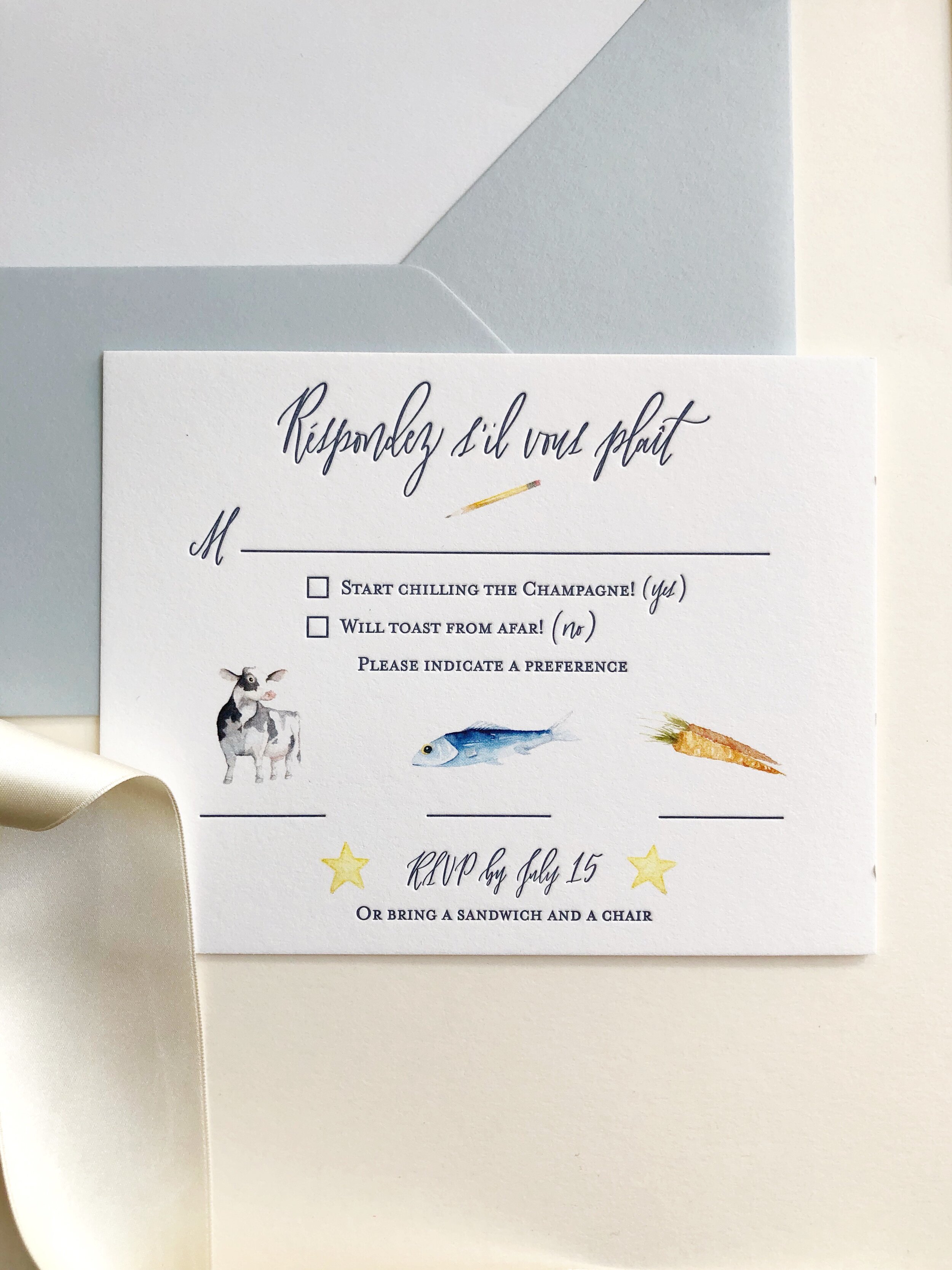
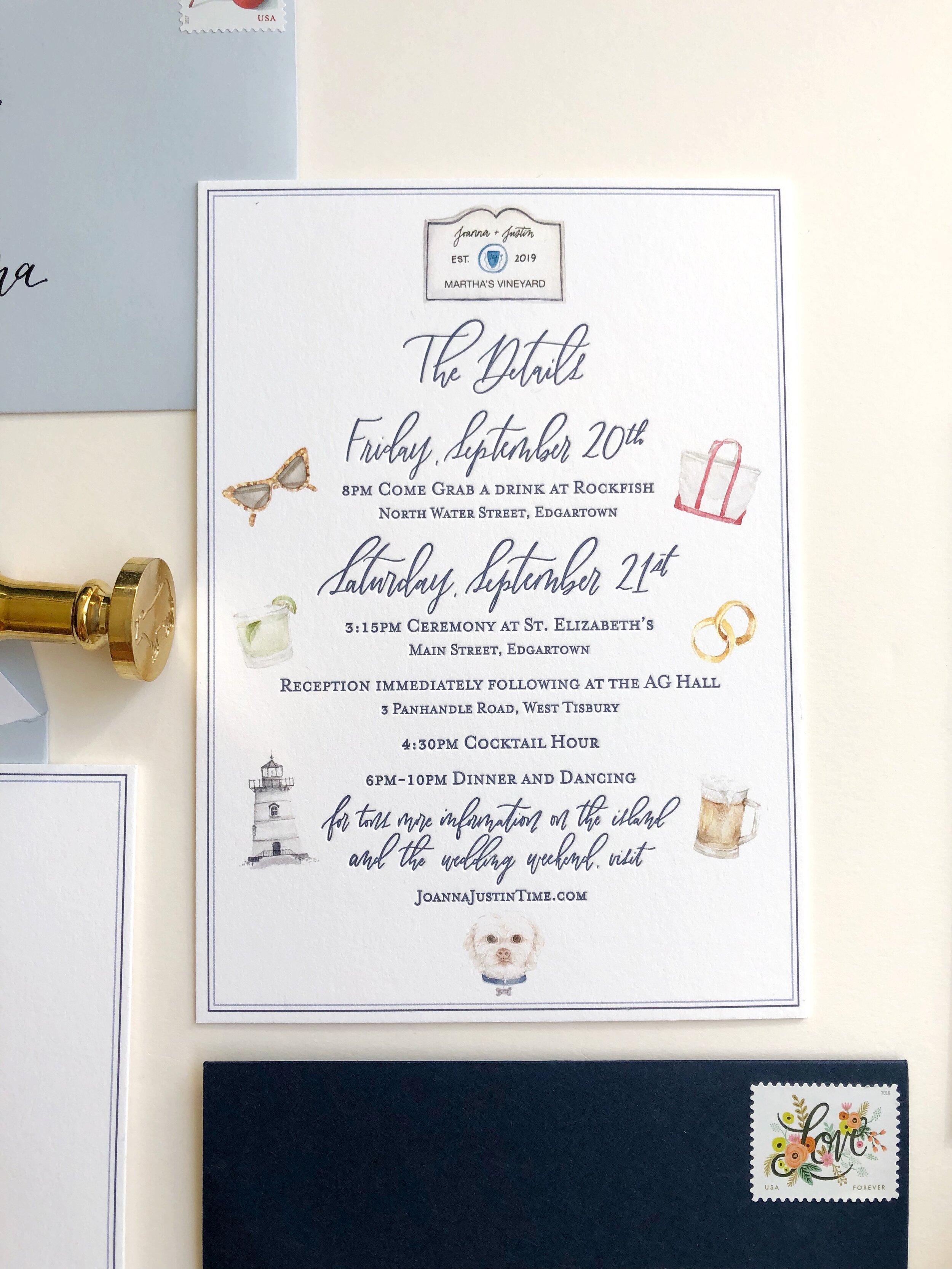
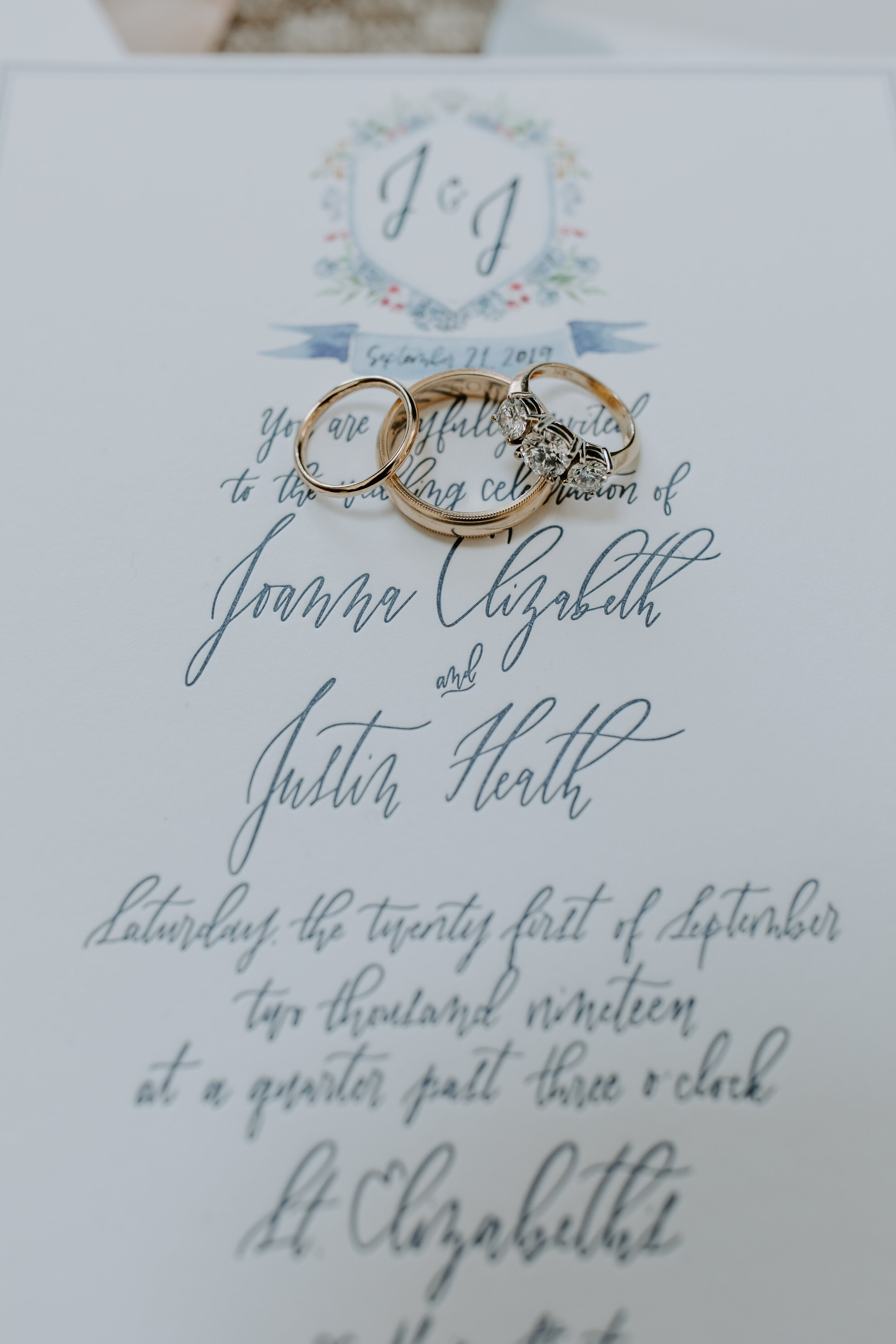
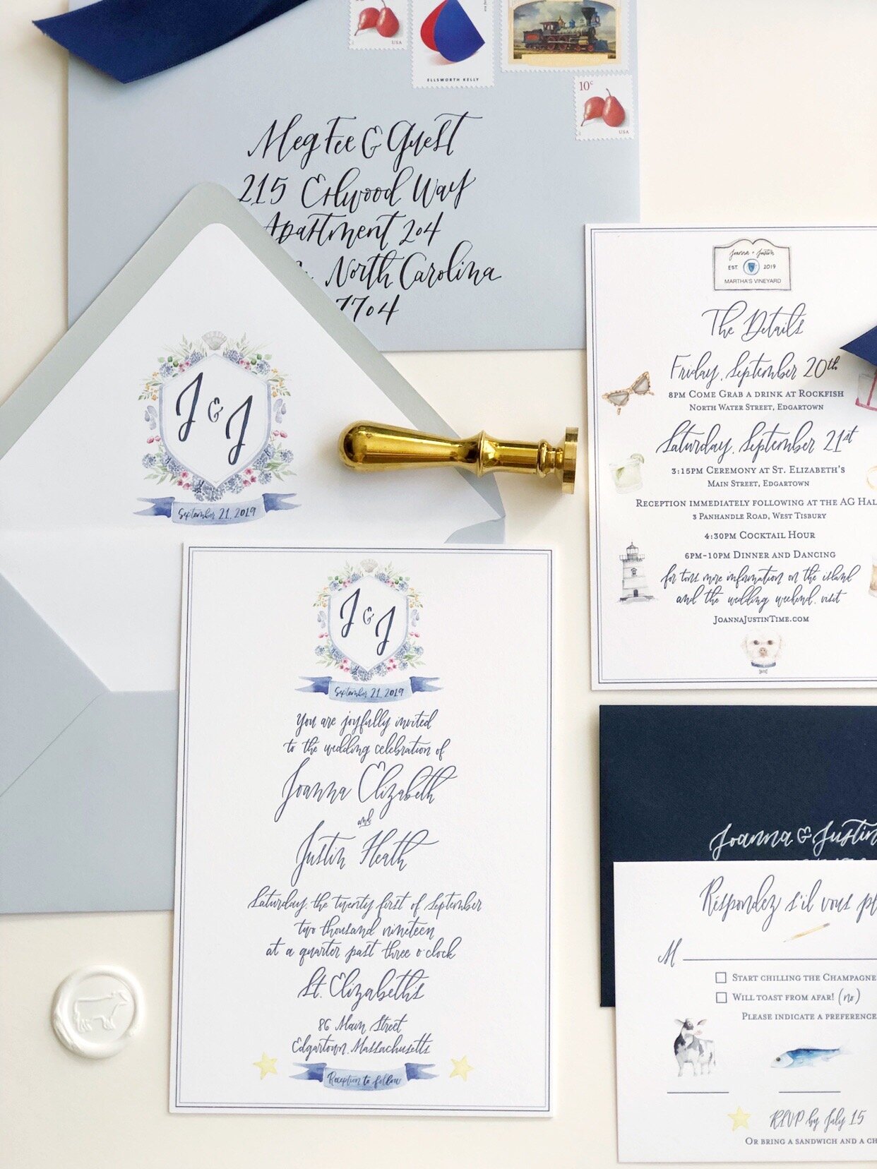
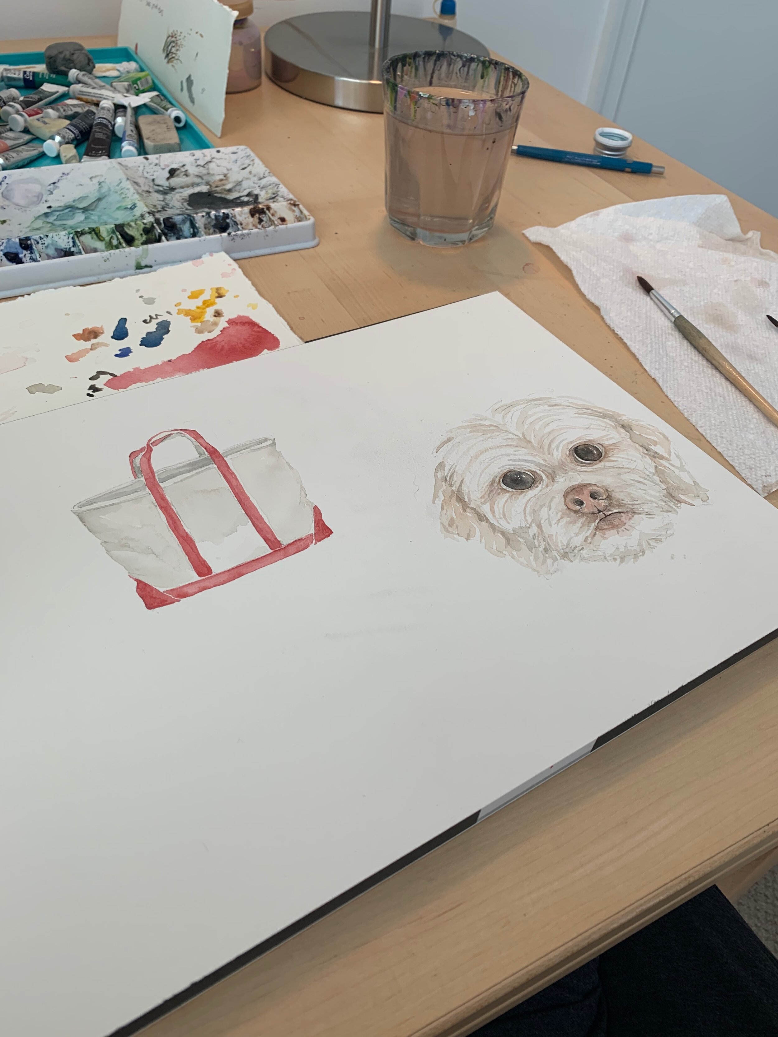
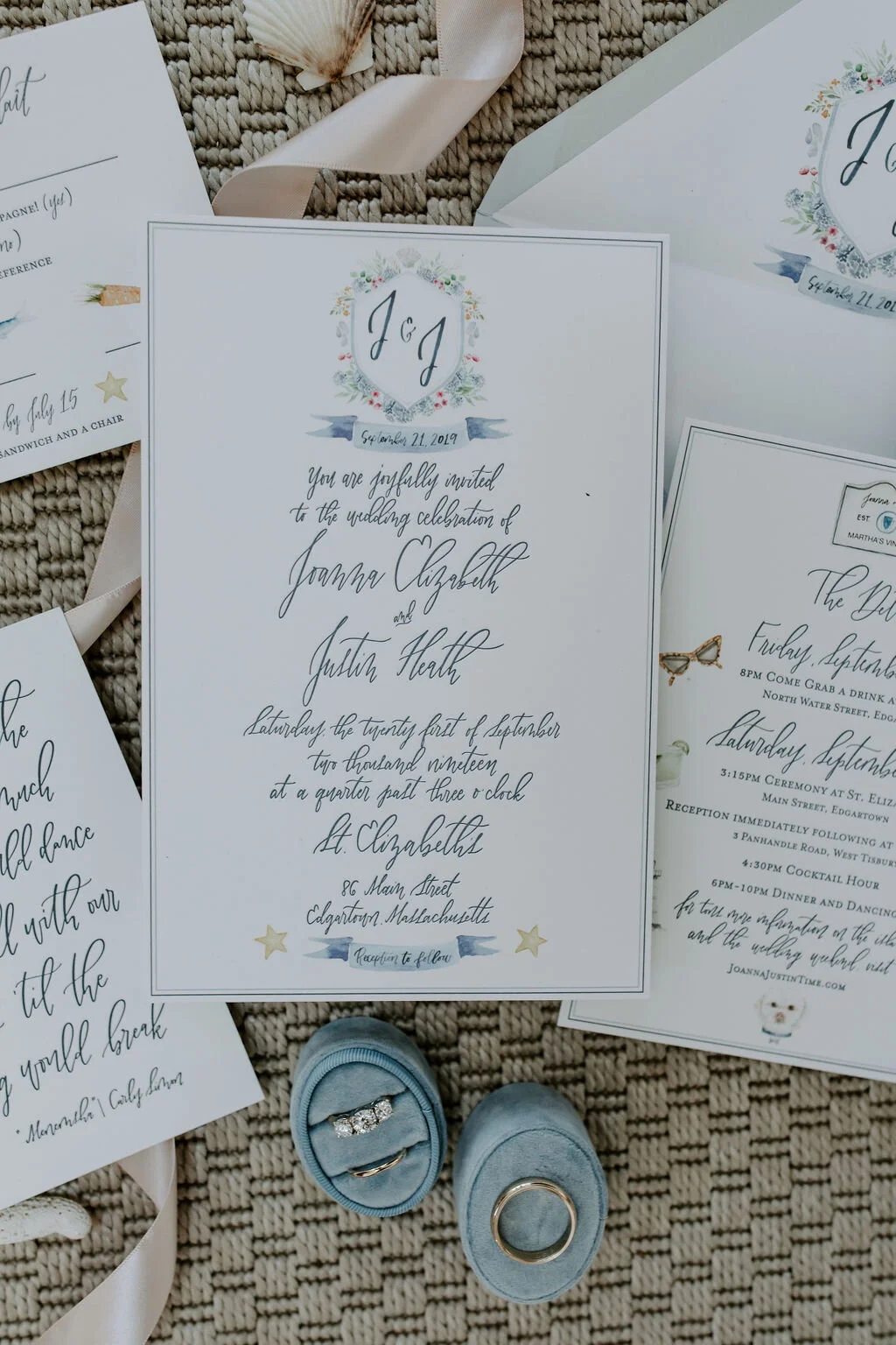
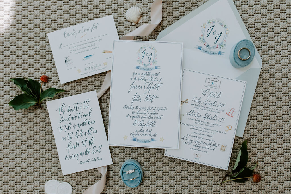
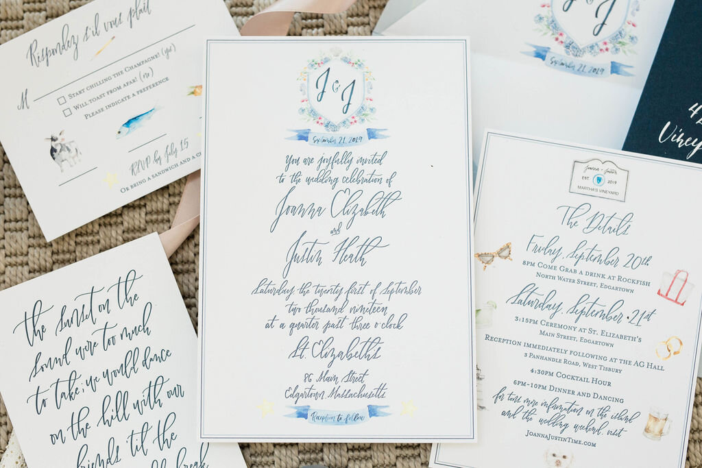
Obviously, these my favorite wedding invitations of all time, as they are my own. (lol) Beautifully illustrated by Tiffany Willey, it’s filled with little nods to Justin and I and to the island of Martha’s Vineyard. I designed the invitations (with lots of layout and tech help by Tiffany) and printed them locally at Print Icon here in NYC. (I love those guys!) Captured on camera on the day by Micaela Grace, the rest shot in my apartment the week they went out to all of our guests.
I knew I wanted to incorporate some illustration, specifically watercolor, because Justin and I certainly have a playful energy to our relationship, and by extension, our wedding. But I also loved illustrated storybooks as a kid, with all their intricate detail and color, so many images which I still think about to this day, so illustration was something I wanted to bring in to our invitations. I also really enjoy hidden easter egg images that have special meaning, so it was a ton of fun to commission Tiffany to paint those and work them into the design. The crest features blue ribbon—the ribbon I knew I was incorporating in my bridesmaids bouquets. It shows rose-hips, which grow in dunes all over the island. Mussel shells, which can be found along the rocky beaches in Menemsha, as well as their blue-hued shells which were the entire inspiration for the wedding color palette! The stars represent the incredibly clear skies over the island at night, where you are completely blanketed in a starry sky, as there are no city lights for miles and miles all around you. Of course, we had to include our puppy Alfie, as well as our trusty canvas beach bag we use to tote our things all around each year, beers for him, a spicy margarita for me, and our favorite lighthouse in Edgartown. (Lighthouses have a special meaning to Justin especially.) Tiffany was a beast. She brought my little ideas to life on the page!
It was a risky choice to do the entire main invitation card in one of my more hard-to-read styles, but it’s my favorite style I do, and let’s be honest— everyone invited knew that was coming. (lol) I also LOVE real handwriting done in letterpress, it’s like a piece of art! We did the whole suite in letterpress, which was something else I knew I wanted to be done for the invitations.
I chose to do the outer envelope in the lighter shade of blue, a little more reflective of the airy nature of the wedding I was planning, but with a deep cobalt to anchor (no pun intended) the suite and reflect the boys’ suits and my bridesmaid in the darkest dress. (I feel as though I need to remind everyone, at this point in your reading, that in NO WAY did I think ANY of this was going to translate to my guests, lol. Just fun to do!)
I did want to use vintage stamps but ended up needing quite a lot of stamps for the practical postage anyway, that I was able to just pick out stamps I liked (that added up to the correct value) and still got to pile them on giving a vintage stamp vignette on the envelopes! I absolutely love working with more than just one stamp for invitation envelopes. They are like little tiny pieces of artwork! So beautiful and unique, even if they aren’t vintage.
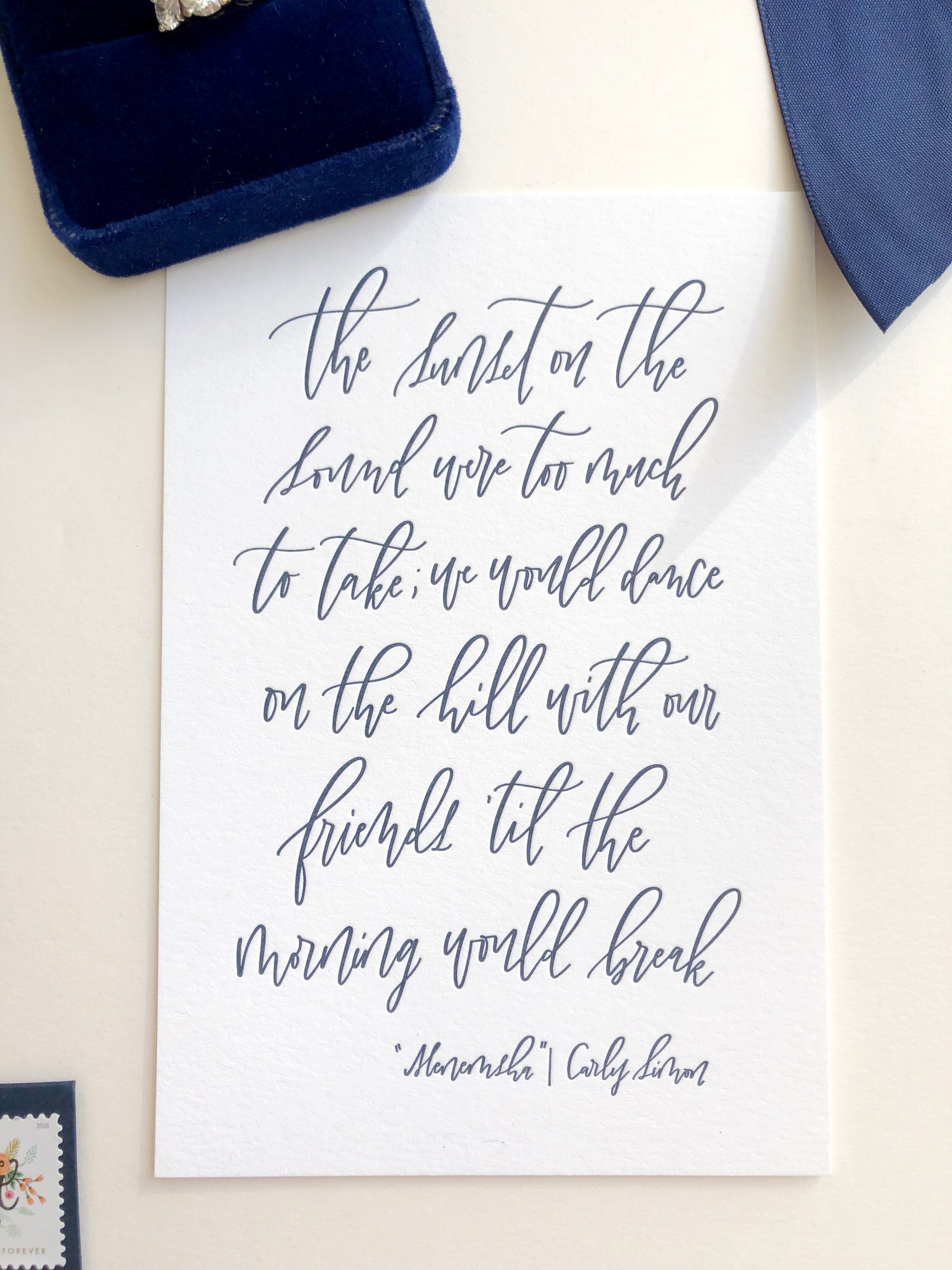
Lastly, I added a Carly Simon song lyric, which I thought brought a whisper of forthcoming festivities to each guest in a small way, and acted as a small keepsake. Simon a native to Martha’s Vineyard! She still lives there today. The song is called “Menemsha”; a song written about Justin and my favorite little fishing village on the island. Carmela over at Fiore Press did these and they are one of my favorite elements in the whole suite. She printed it so beautifully!
